Introduction
Statistics involves collecting, analyzing, and presenting data. Visual representation through graphs makes complex data easy to understand at a glance. Whether comparing sports stats or budgeting, graphs provide a clear picture of numbers.
Understanding data distribution through visual charts.
Sub-topics
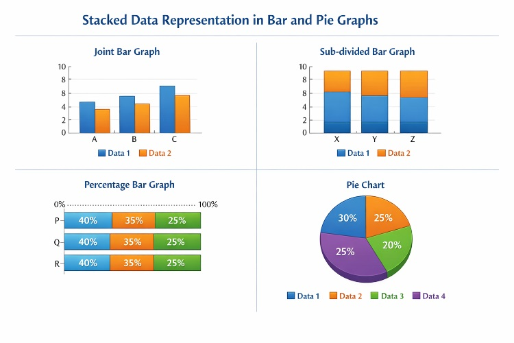
1. Joint Bar Graph
This graph displays two or more sets of data side-by-side for the same category. It is ideal for direct comparison.
Examples
Example 1: Sales Comparison (Real-life)
Tricky Example
2. Sub-divided Bar Graph
A single bar is divided into different parts to represent components of a whole. The total height of the bar shows the sum.
Examples
Example 1: Family Savings (Real-life)
3. Percentage Bar Graph
In this graph, all bars are of equal height (100 units). It shows the proportion of each part relative to the total.
Examples
Example 1: Literacy Rate (Real-life)
4. Pie Chart
A circular graph divided into sectors, where each sector represents a proportion of the whole 360°.
Examples
Example 1: School Budget (Real-life)
Tricks and Shortcuts
* In Percentage Graphs: (Part / Total) × 100 is your magic formula.
* For Pie Charts: (Value / Total) × 360 gives you the angle in degrees.
Common Mistakes
* Using different widths for bars; all bars must have equal width.
* Forgetting to write the scale (e.g., 1 cm = 10 units) on the Y-axis.
Practice Questions
Easy Questions
- Draw a bar graph showing the favorite fruits of 10 students.
- What is the total sum of angles in a pie chart?
- If a bar is divided into two parts, what kind of graph is it? (Tricky)
Medium Questions
- A student scored 40 out of 50 in Math. What percentage will this be in a percentage bar graph?
- If a sector in a pie chart is 90°, what fraction of the whole does it represent?
- Compare the number of bicycles and cars in a parking lot using a joint bar graph. (Real-life)
Hard Questions
- When comparing the growth of two companies with very different starting capitals, why is a percentage bar graph better than a sub-divided one? (Tricky)
- A company has 30% profit. Calculate the angle for this in a pie chart. (Real-life)
- Draw a sub-divided bar graph where the total is 200 and it consists of three parts in the ratio 2:3:5.
Revision Summary
Graphs transform numbers into stories. Use joint bars for comparison, sub-divided bars for totals, percentage bars for proportions, and pie charts for parts of a whole.
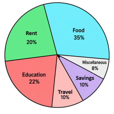
What percentage of total expenditure do 'food' and 'rent' together cover?